Designing the Hero Shot:
The Anatomy of a Powerful Product Visual
A hero shot is not simply the most polished image in a campaign. It is the frame where product, brand character, composition, light, material and environment have to resolve into one clear visual statement.
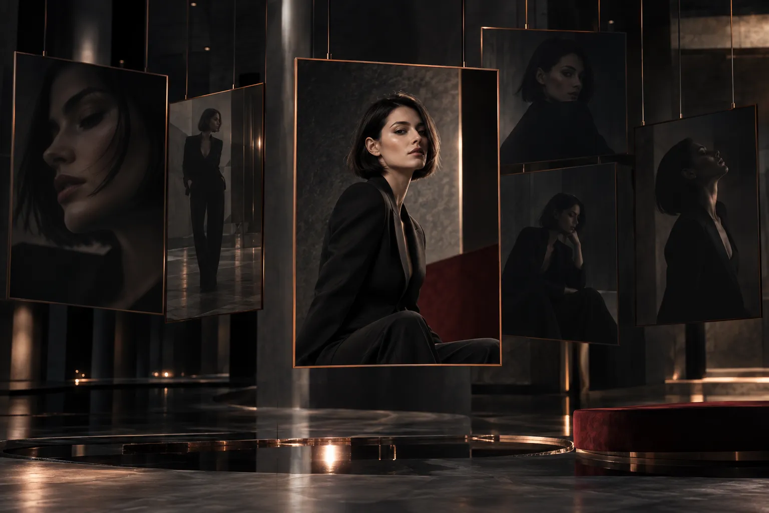
The short answerA product hero shot works when its decisions agree. The character the product should project comes first; the camera then gives it status, silhouette and hierarchy make it readable before any surface does, light interprets it, one material leads, and the environment adds only what the idea needs. The last decision is usually subtraction. The result is rarely the most elaborate frame in a campaign. It is the most resolved.
A strong product visual can often be recognised before anyone studies it. Before the viewer looks at the material, notices the reflections or wonders how the image was made, something about the frame already feels resolved. The product has presence, the composition feels deliberate, and the light reveals exactly what matters.
That is what I think of as the product hero shot. It usually carries more responsibility than any other image in a visual system. It may introduce the product and set the tone of the campaign; it becomes the key visual, the thumbnail, the opening frame and the billboard, and it is the image people remember once everything else has gone.
That responsibility makes it tempting to treat the hero shot as a production problem: find the best angle, light it beautifully, refine the materials and add detail until the frame impresses. But the strongest hero shots are rarely the most impressive frames. They are the most resolved, and what resolves them is a series of decisions made long before the final render.
Mustafa WerekiaArt Director & 3D Generalist
A hero shot is a compressed brand decision
A product can be photographed or rendered from hundreds of valid angles, and only a few express the right character. That is what makes the hero shot an art-direction problem rather than a camera problem. The useful first question is not which angle looks best, but what needs to be understood from this image.
A hero image cannot optimise for everything at once. It might need to introduce a product, reveal craftsmanship, signal performance, suggest innovation or establish a premium position, and each of those leads somewhere different. A product built around precision may need a controlled, almost architectural frame. One built around performance may need tension and direction. One whose story is material craftsmanship may need a close camera and carefully shaped reflections.
Every object also has a visual personality of its own. Some feel technical, some soft, some sculptural, some severe. The hero shot works best when it amplifies that character instead of imposing a language that does not belong to the product. A fragrance and a performance product may both use dramatic CGI, yet their visual logic should not be interchangeable. Because the image has so little time to establish all of this, I think of the hero frame as a brand decision compressed into one picture.
A hero shot is not the image that shows the most. It is the image that decides what matters.
The camera establishes status before detail does
Before the viewer notices a shader, a bevel or a reflection, they meet the relationship between the object and the camera, and that relationship already carries meaning. Height, distance, lens, rotation and crop are not technical settings applied after the creative decision. They are part of it.
The camera is never neutral. Looking up at a product gives it power; meeting it head-on suggests confidence; a macro view makes craftsmanship the subject; a three-quarter view balances form and depth; an overhead frame can turn the object into a graphic shape. Each asks the viewer to encounter the product differently: to admire it, study it, want it, understand its engineering or feel its scale.
Focal length is one of the quieter of these decisions and one of the most influential. A wide lens exaggerates perspective and adds energy; a long lens compresses space and tends to feel calmer. Neither is better. For refined product imagery I usually avoid distortion the concept does not ask for, because a lens that bends the proportions can make an image exciting while making it less faithful to the object. A campaign built on energy may want exactly that exaggeration. What matters is that the choice is conscious. The right camera does not simply reveal the product. It gives the product a point of view.
Silhouette and hierarchy come before the surface
A strong hero shot has structure before its materials become beautiful. One of the most useful tests is to ignore the surface entirely: reduce the product to a dark shape, set aside texture and reflections, and see whether the frame still works. Can the form be understood? Does the angle reveal its defining proportions? Is the path for the eye clear? If the silhouette is weak, additional detail rarely solves the problem.
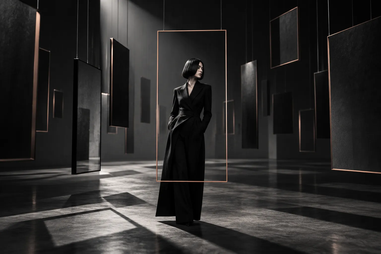
This matters in CGI because detail is easy to accumulate. A polished material can make a weak composition feel finished, and microdetail can make a render impressive at full resolution without giving it any order. A powerful product image has a primary form, perhaps one secondary detail, an environment that supports them, and everything else quieter. That is not the same as minimal; a dense frame can have excellent hierarchy if its density is organised. Placement follows the same logic. Symmetry can give a product authority, an offset position can add tension, and a rich environment can easily become more interesting than the object it was built to present. A hero shot should never make the viewer search for the hero.
Negative space belongs to that structure. It lets the eye rest, isolates the subject and carries a sense of confidence; an object surrounded by controlled space often feels more important than one competing with its surroundings. In commercial work it also leaves room for what comes later: a headline, a product name, a logo, the different crops a campaign will need. Considered early, typography works with the frame instead of fighting around it. A strong frame also keeps its structure as a small thumbnail, when most of the detail has disappeared. How hierarchy and restraint shape the sense of quality more broadly is where The Art Director’s Eye begins.
Light describes character, not only geometry
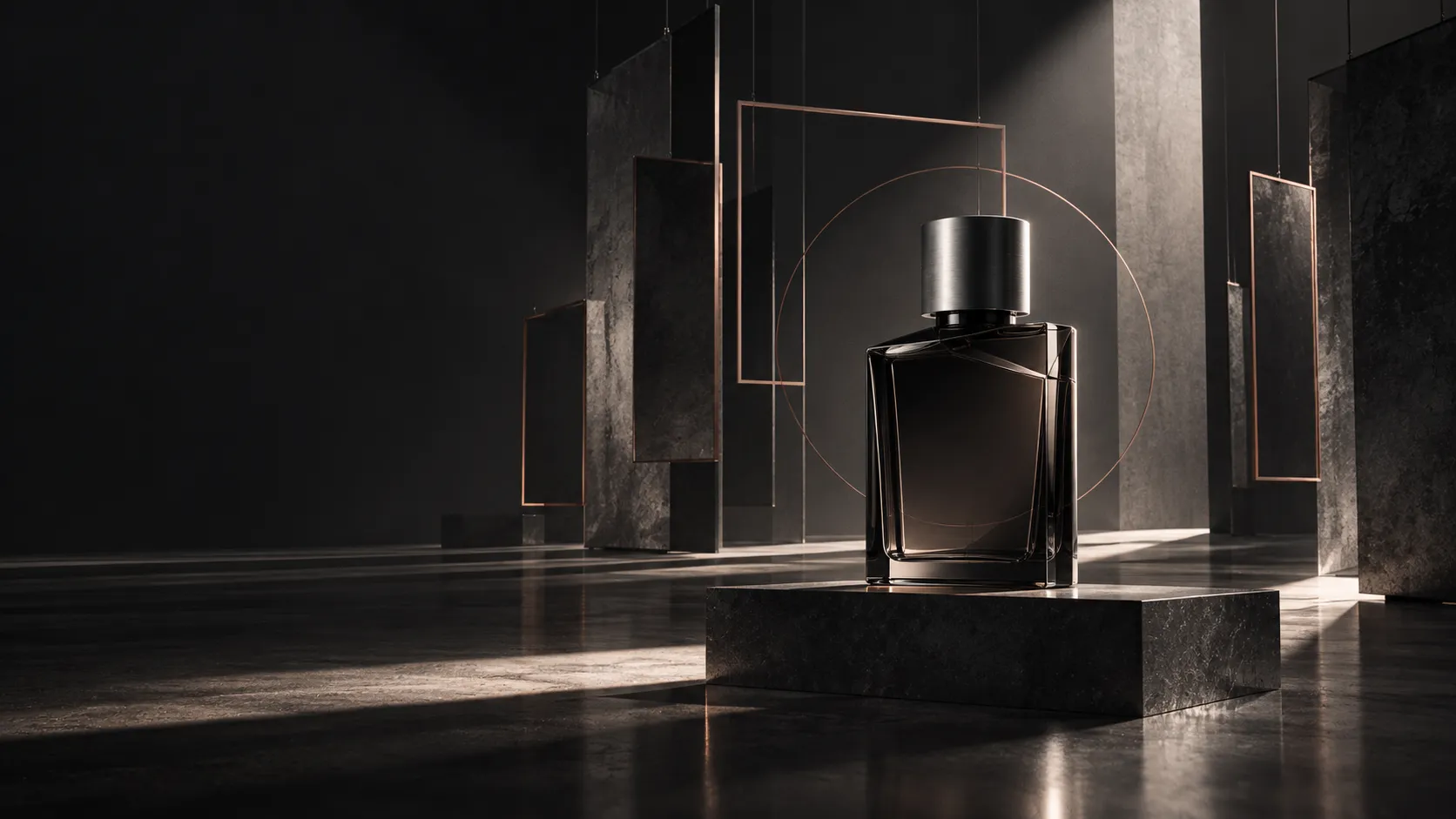
Product lighting is usually judged by how well it reveals form, and that matters: edges need separation, materials need a believable response, transitions need to make sense. With glass, metal, polished plastic or lacquer, much of the form is carried by reflections, so lighting the object also means designing what it reflects. Good product lighting often feels almost sculptural.
A hero shot asks more of light than accuracy. A broad, soft gradient makes a form feel refined; a sharp highlight brings precision; deep shadow adds weight or mystery; backlight puts the silhouette first. A narrow reflection can make metal feel engineered, while a large, controlled one makes the same metal feel luxurious. These are not simply different set-ups. They are different interpretations of the object, and the same product can move from technical to sensual, or from accessible to exclusive, through light alone. The question that matters is less “Is the object correctly lit?” than “Which version of the object is this light presenting?”
Light also decides what stays unrevealed. A hero shot does not need to explain the whole product. A controlled shadow can create anticipation, a cropped detail can suggest scale, and a reflection can describe a surface without spelling it out. Leaving one area partly hidden often makes the visible parts feel more intentional. Secondary frames can explain what the hero chooses not to show.
Materials need a focal point
Once camera and composition are resolved, material quality becomes critical, because a hero shot brings the product under close scrutiny. Brushed metal should respond differently from polished aluminium; soft-touch plastic has a different highlight from high gloss; glass depends on its thickness and on what surrounds it. These small behaviours decide whether the object feels physically present.
Credibility and emphasis are still different things. If a product combines metal, glass, plastic, fabric and fine detail, all of them have to be believable, but usually one carries the emotional weight. A polished edge speaks of precision, a translucent surface of softness, a tactile texture of intimacy, a restrained matte finish of sophistication. Choosing which quality leads shapes reflection strength, roughness, contrast, highlight placement and how close the camera comes. When every surface tries to show how well it has been rendered, the image becomes democratic when it should be selective. The viewer does not need to notice every material. They need to believe all of them and remember one. Why credibility on its own is never the whole answer is set out in Why Photorealism Alone Is Not Enough.
Detail and colour follow the same rule. Chamfers, engraving, stitching and machined edges build credibility, but a hero shot is not a technical diagram. A detail that stands for quality belongs in the frame; one that only adds busyness belongs in a secondary shot. Colour can make a neutral composition memorable through a single accent, or let material differences lead in a monochrome setting, as long as it never overpowers the object. The hero image establishes desire and identity first. Explanation can follow.
The environment has to earn its place
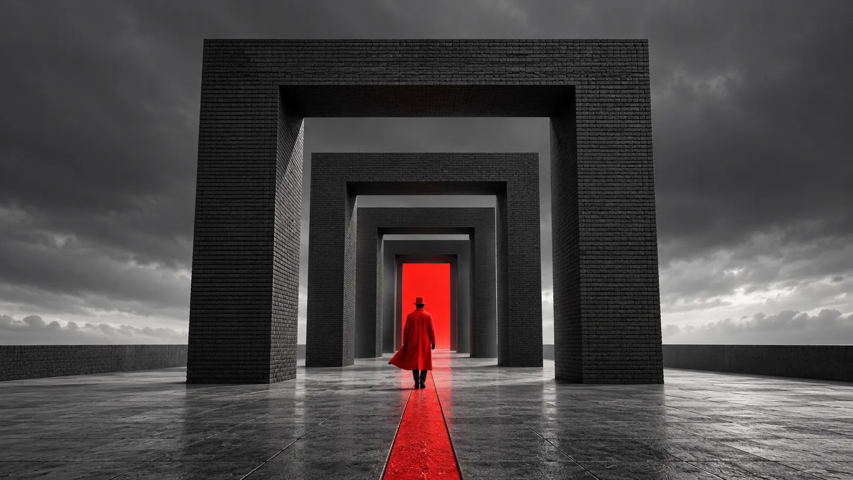
A product does not automatically grow stronger inside a sophisticated environment. Sometimes the strongest setting is almost nothing: a floor, a gradient, one architectural gesture, enough depth to establish scale. At other times the world around the product carries much of the idea. Architecture can exaggerate scale, repeated geometry can communicate precision, organic forms can create contrast, and a large empty space can make a product feel rare.
The difference lies in the question being asked. “What environment would look good around this object?” tends to produce decoration. “What does the environment add to the way the object is perceived?” produces a role: framing, scale, contrast, atmosphere, narrative or brand character, expressed through colour, form, material or light. If removing an element makes the product clearer without weakening the idea, it never belonged in the hero frame. A hero shot does not need a large world. It needs the right amount of world.
The strongest frame is refined by subtraction
Near the end of production, the temptation is to keep improving the image by adding: more reflections, particles, atmosphere, secondary objects, surface detail or contrast. Some of that helps. But at this stage I find myself removing more than adding. One reflection turns out to be unnecessary. The background needs less contrast, the camera a fraction less rotation, one colour less strength, and a secondary object proves to be a distraction. These are small decisions, but together they decide whether an image feels merely polished or resolved.
In motion, the same judgement becomes a matter of time. In a product film the hero shot may be a moment rather than a still: the instant the product settles, the first complete reveal of its silhouette, a pause after movement. If the sequence moves through that moment too quickly, nobody experiences it. Sometimes the most important decision is simply to hold the frame and let the light settle. How timing becomes part of art direction is explored further in Still Image to Moving Experience.
Takeaway
There is no universal hero angle, no universal lighting set-up and no render setting that creates a powerful product image on its own. The answer comes from the object itself: its character, its purpose, its brand, its audience and what the image has to say.
For me, designing a hero shot means reducing all of those variables to one decisive moment. The camera interprets, the composition organises, the light describes, the materials create credibility, the environment gives context, and art direction makes sure they all tell the same story. The hero shot is not the image with the highest production value. It is the frame where the project becomes most concentrated, and where the product is expressed most clearly and memorably.
Mustafa WerekiaArt Director & 3D Generalist based in Dubai, working internationally across visual direction, CGI, motion and brand systems. About the practice.